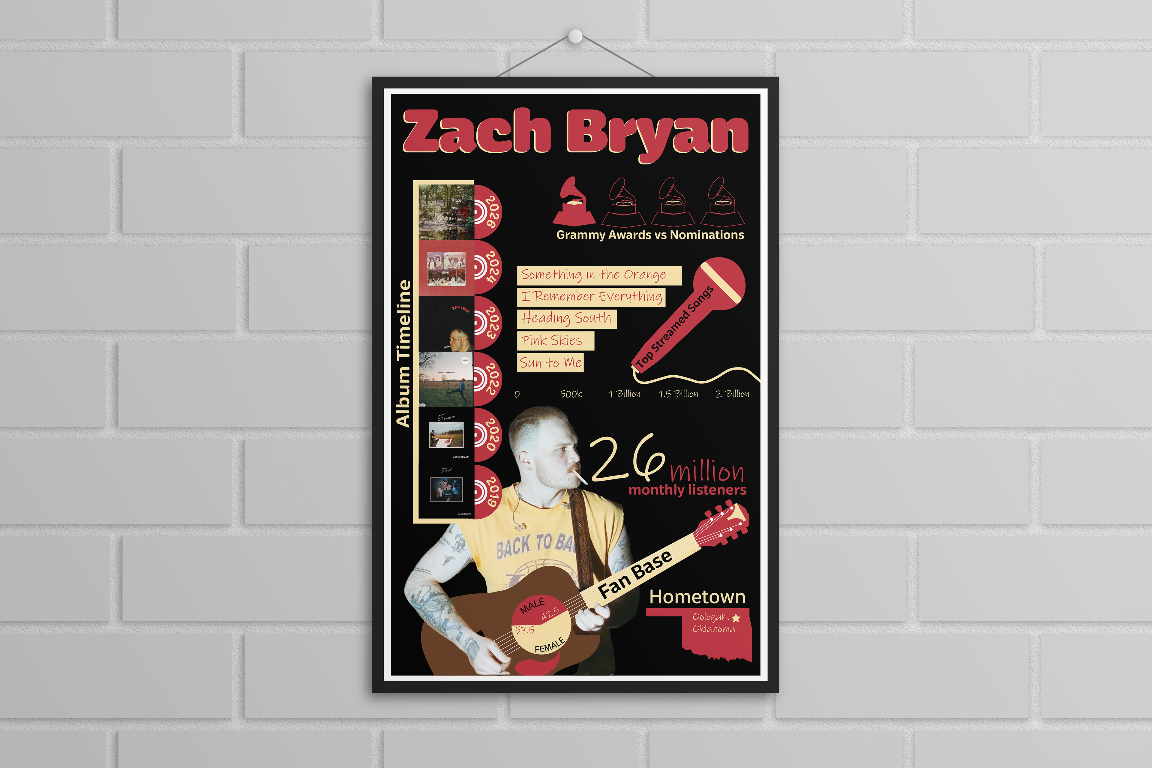
For this infographic, I wanted to introduce audiences to Zach Bryan through quick facts about his life and music in a visually engaging way. I combined hand-drawn illustrations with curated data to create a storytelling experience, using a color palette inspired by his album covers and personal style to reflect his brand while keeping the design cohesive throughout.
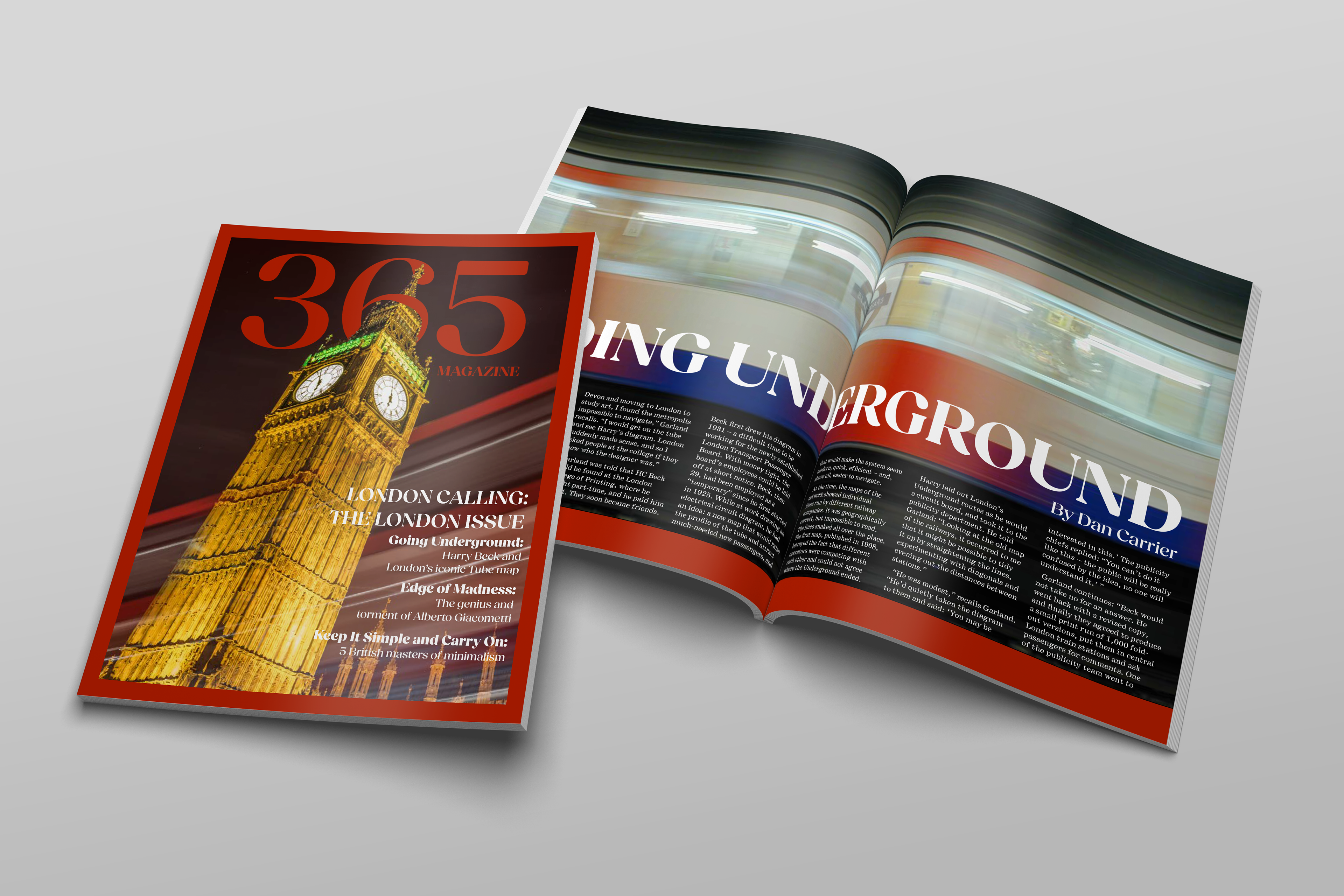
For this magazine, my goal was to create a sense of movement while keeping the overall publication cohesive and easy to read. I focused on consistent typography, dynamic imagery, and a red-based color palette to unify the spreads and guide visual flow throughout the design.
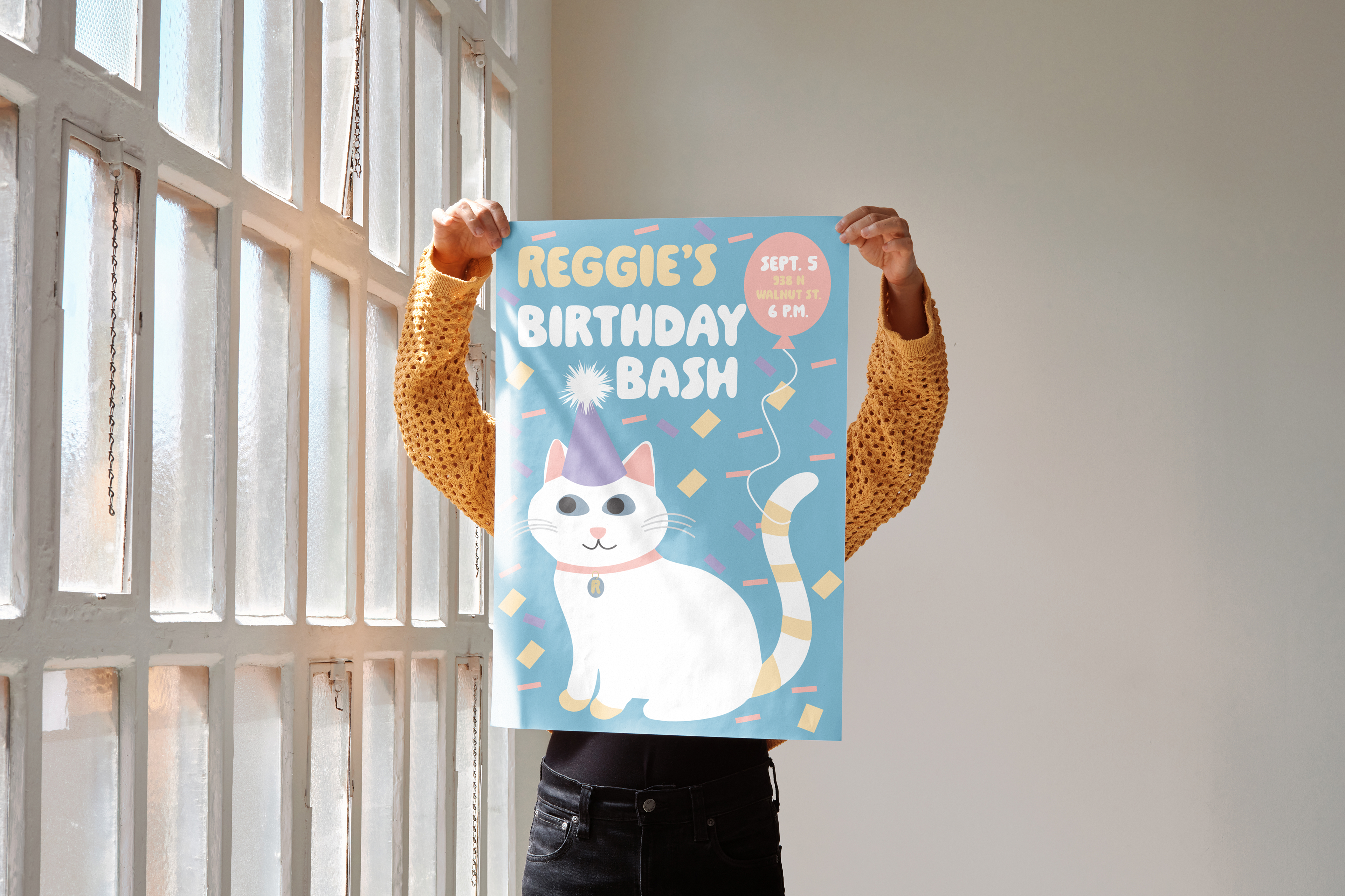
For this poster, my goal was to make my cat, Reggie, the clear focal point while creating a playful and cohesive design. I developed a stylized illustration inspired by his features and built the color palette directly from his eyes, nose, and fur to create a personal connection. Through typography, character interaction, and thoughtful visual details, I aimed to create a fun, personality-driven composition.
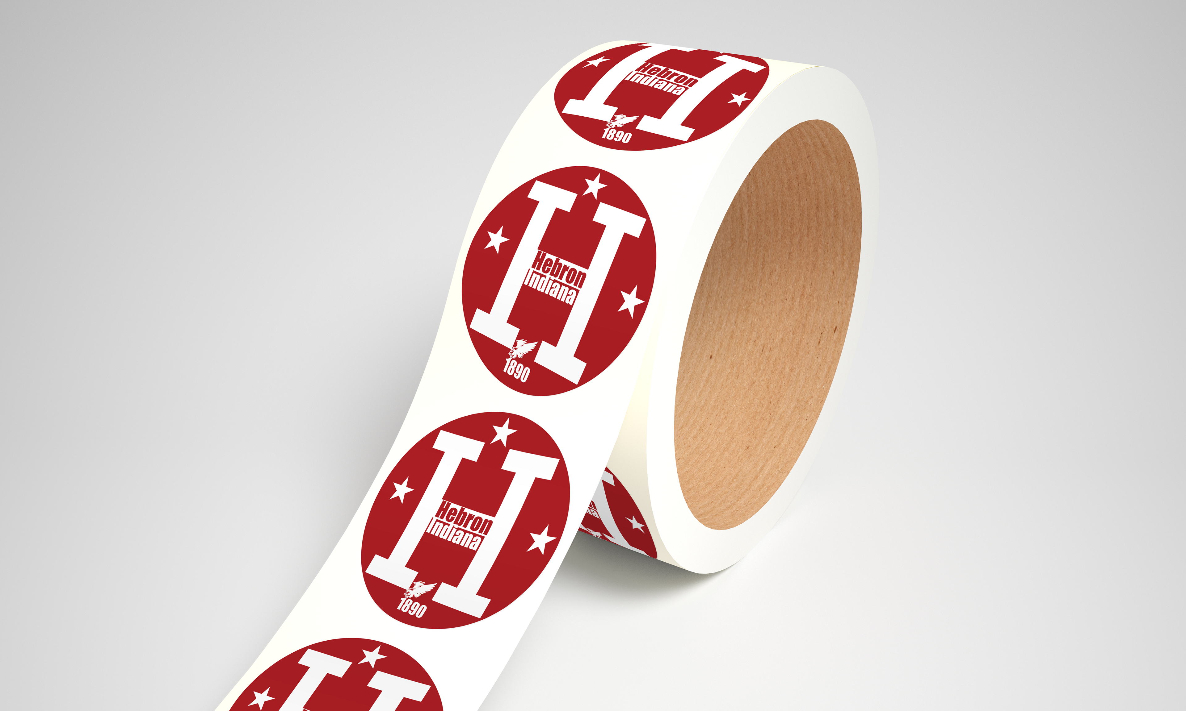
For this hometown sticker, I wanted to capture the identity of Hebron, Indiana through familiar local visuals and community pride. I drew inspiration from town signage and posters, incorporating the school colors and mascot to create a simple, recognizable design that remains clear and easy to read.